How did the Midjourney AI interpret 4 very different artists? Part 2
In Part I of our attempt to test how Midjourney’s AI interpreted the styles of different artists, we didn’t see any major differences when we asked it to apply the styles of Takehiko Inoue, Robin Eley, Frank Miller and Edward Hopper to the same starting image of an “Old Japanese man.” There were subtle differences, sure. But how much of that was because of the randomness of the Midjourney processing and how much because of the influence of the artistic styles? Impossible to tell with such a non-scientific, small sample size test.
One reason might have have been due to the artists I selected for the exercise – they were distinct from each other but no radically so. But what if we go to the extremes?
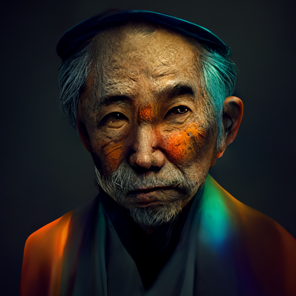
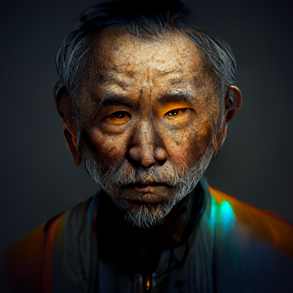
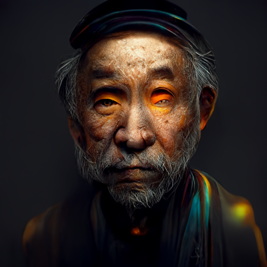
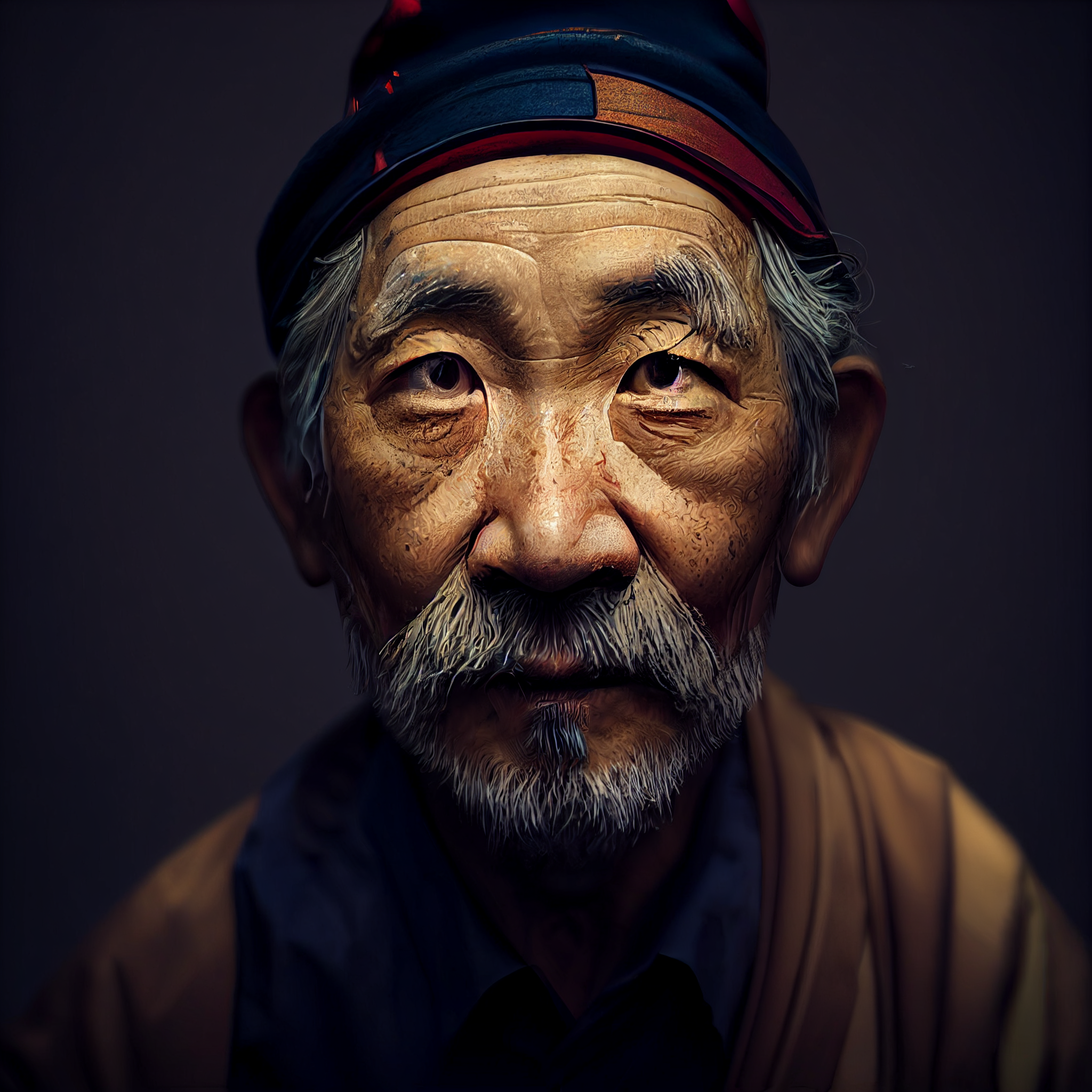
For round two, I chose Joan Miro, Rembrandt, Richard Avedon and Andy Warhol. This time, there were some were some significant differences in styles and mood.
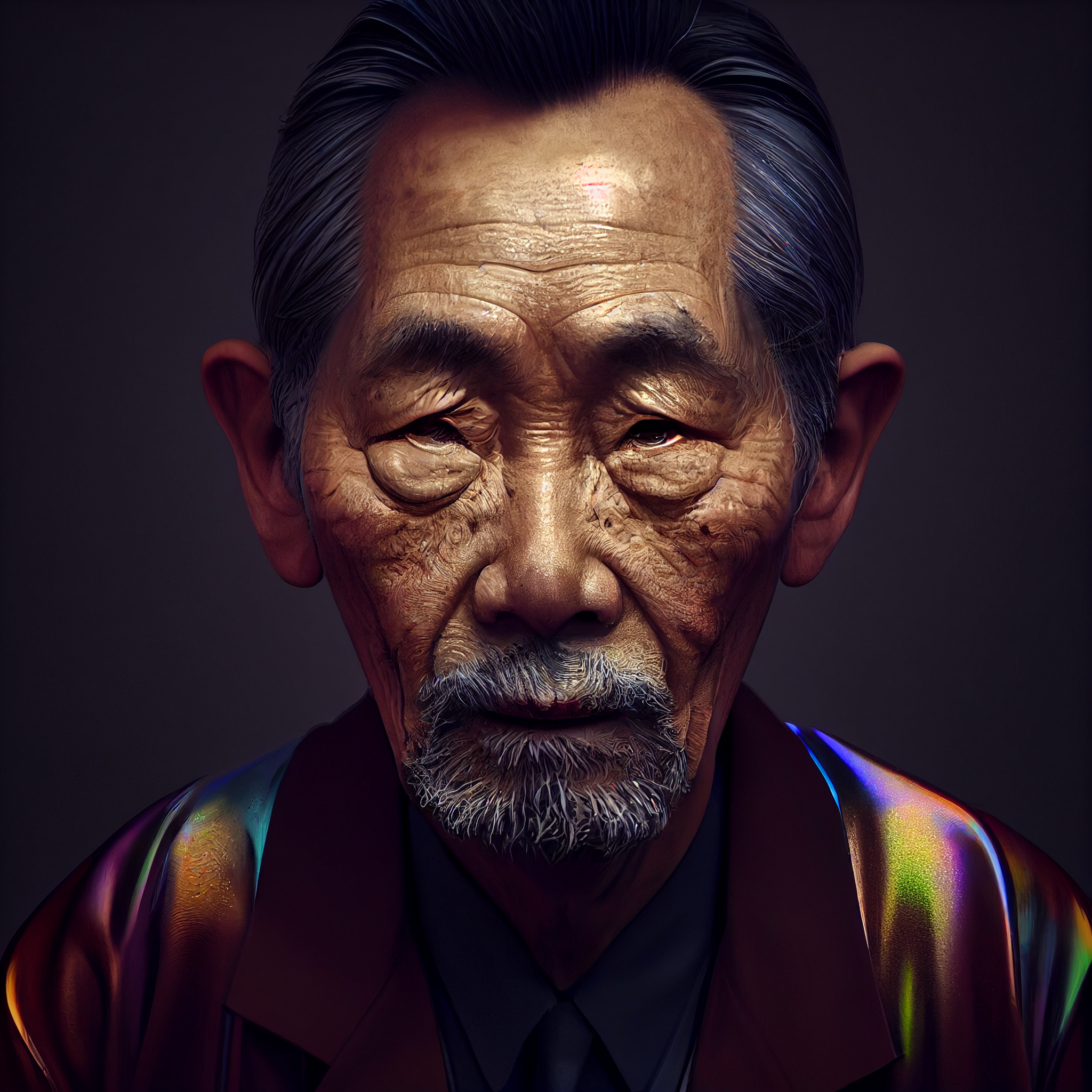
Here’s what I did: I added “in the style of <the artist>” as the variation to the same image used in Part I. That image had the base text prompt of “old japanese man, orange accent lighting, iridescent chromatic colour-shifting, dynamic lighting, octane render, 8k, hyper detailed, studio lighting, 3d render, hyper realism, photo realistic man.” I upscaled all the images the same number of times, remastered each of them at the same stage and then upscaled the first version of each remastered image. I’m not pretending that this has scientific merit. Any conclusions are purely anecdotal, and the whole thing was just for fun to help me understand the Midjourney AI better.
With that disclaimer, the most dramatic shift was the Warhol progression. By the end, the AI had morphed the old Japanese man into Andy Warhol. It was the most radical evolution, from the hair to the clothing. The final version included some pop art flourishes of blue and orange coloration in the hair and eyeglasses.
The Miro progression was also striking in its use of color. The final version had some funky orange coloration of the eyes and a multi-colored jacket, as if the AI was trying to break free from the “hyper realism” of the text prompt.
The Avedon and Rembrandt images actually were most alike. They actually both havd very similar in lighting styles. I had guessed that the AI might interpret the Rembrandt style by using what is known in today’s photography world as “Rembrandt lighting,” where half the face is in shadow with the trademark triangular patch of light under the eye on the shadow side. Instead, the light is similar to what is found in Rembrandt’s famous Self-Portrait, 1659.
Likewise, I was wondering if the AI would change the background of the Avedon image to white without me prompting it to. While it didn’t do that, it did produce a final image that immediately made me think of Avedon’s famous portrait of the author Gabriel García Márquez. The bags under the eyes of our Japanese man are an exaggeration of those found on Márquez.
So, yes, asking the AI to create “in the style of …” definitely has an effect on the AI’s interpretation of an image, though the results can be subtle as seen in our Part I results are quite fanciful as we saw in round two. The question, however, remains what happens when the images are not static studio headshots? We’ll get to that in Part 3.

